
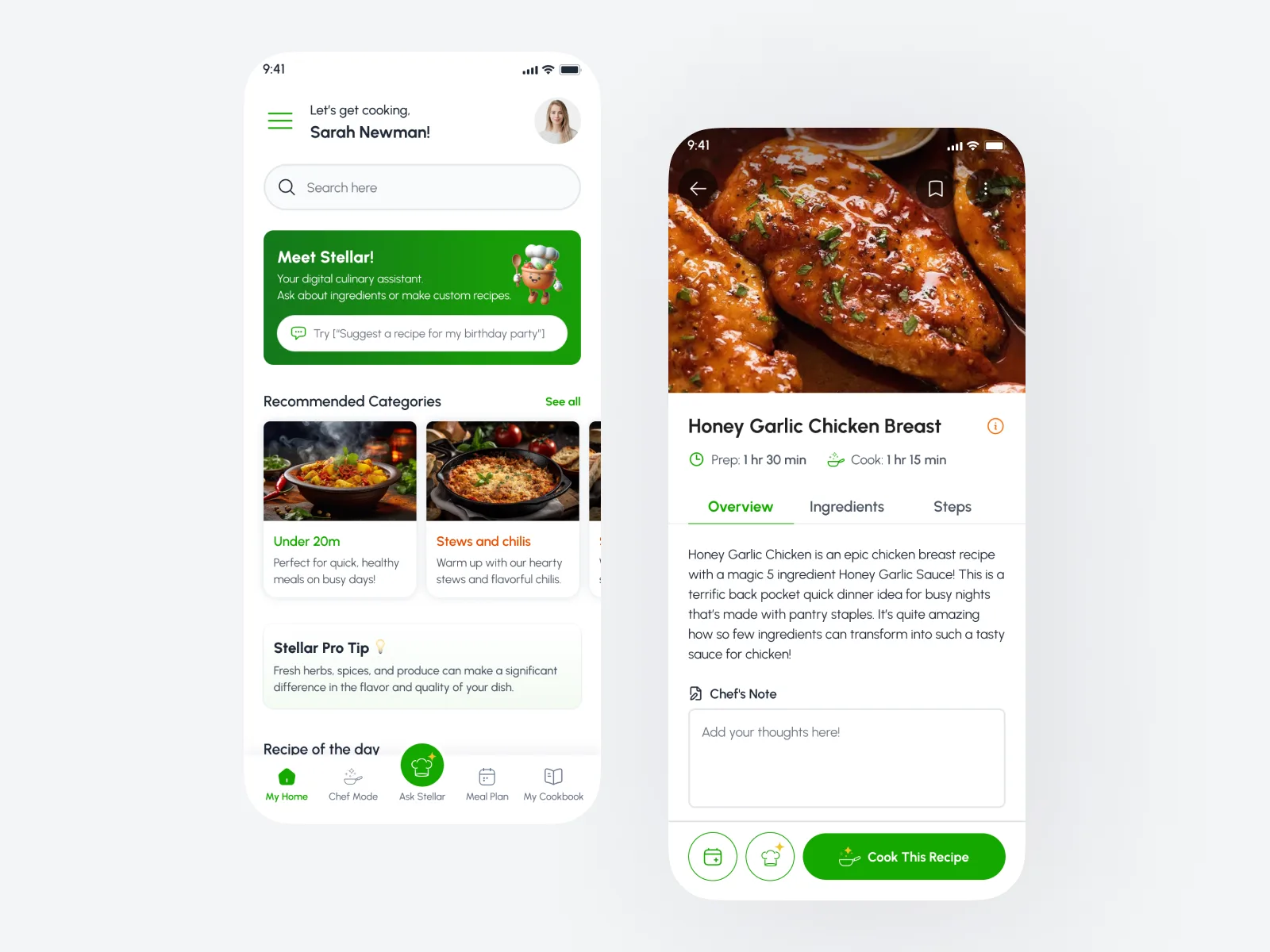
The brief
Stellar Eating wanted a home-cooking product that felt as inviting as a well-run kitchen — not another recipe dump. The team needed UI/UX that worked for beginners and experienced cooks, plus a design system they could keep shipping on without reinventing every screen.
The challenge
Cooking apps often fail in the same places: dense flows, weak hierarchy, and visuals that look nice in a deck but collapse in real use. Stellar also needed brand consistency across the app, guidelines, and social — so design decisions had to scale beyond a single feature.
Competitors like Samsung Food set a high bar for polish. Our job was to make Stellar feel distinct while staying obvious to use when someone is mid-prep with messy hands and limited attention.
Research and concept
We started with how people actually cook: scanning ingredients, deciding what to make, managing inventory, and coming back later for the next step. That shaped information architecture before pixels.
We reviewed competitor patterns, mapped primary journeys, and pushed for graphics that keep people engaged without turning every screen into noise. Accessibility across ages mattered — larger tap targets, clearer labels, and flows that do not assume “power user” habits.
What we designed
- Core app UI for discovery, cooking, and inventory moments
- A scalable design system (components, type, color, spacing)
- Brand guidelines the team could hand to future collaborators
- Supporting social assets aligned to the same system
Process
Work moved in tight loops with the Stellar team: explore → critique → refine. Hi-fi screens came only after structure felt right. We treated the design system as a deliverable, not an afterthought — so engineering and marketing could reuse the same language.
Outcome
Stellar left with a coherent product UI, a system built for iteration, and brand assets that match the app. The engagement ran about four months and covered UI/UX through delivery of guidelines and social support.