
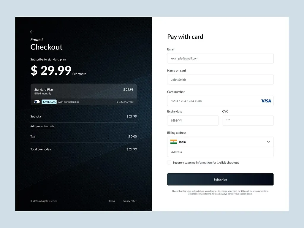
The brief
Faaast needed checkout screen design focused on speed, payment confidence, and a clean form layout — the moment where hesitation costs revenue.
The challenge
Checkout UI has no room for cleverness that confuses. Fields, errors, payment methods, and confirmation states have to feel inevitable. The design also needed to sit comfortably in a product context that includes dashboard and form patterns, not a one-off marketing mock.
Approach
We designed the checkout as a calm, high-clarity flow:
- Hierarchy that answers “what do I pay?” immediately
- Form grouping that reduces cognitive load
- Payment states that feel secure without visual panic
- Patterns reusable in related dashboard/form surfaces
What we designed
- End-to-end checkout screens
- Clear payment and form hierarchy
- UI patterns aligned with dashboard/form contexts
Outcome
Faaast received a focused checkout UI built for confidence and completion — the kind of craft users only notice when it is missing.