
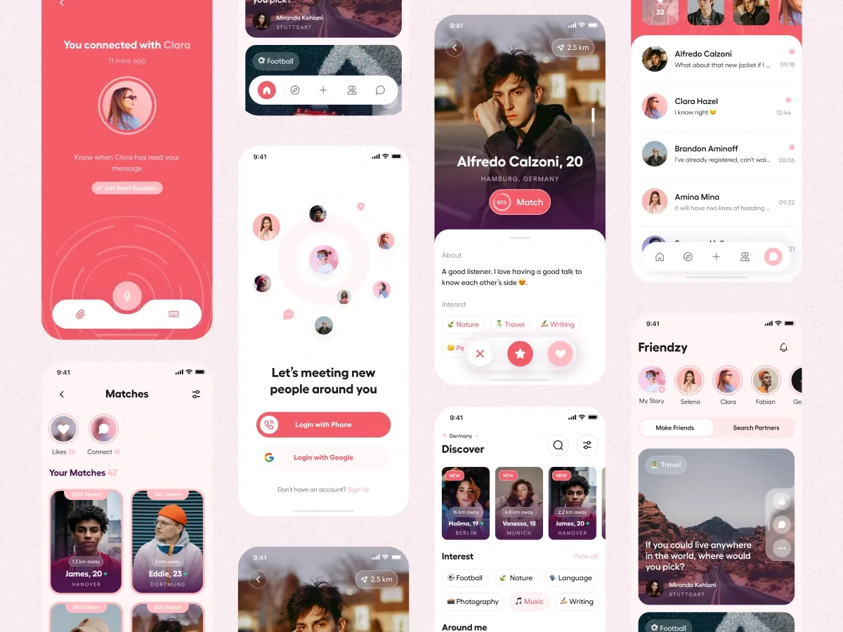
The brief
HeloDate needed mobile UI/UX for a dating app built around nearby matching, secured chat, and a signup path that does not demand a card up front.
The challenge
Dating apps live or die on first-session clarity and safety cues. Nearby matching has to feel exciting without feeling invasive. Chat needs trust signals. Onboarding has to be fast — especially if you are removing card requirements that other apps use as a gate.
Approach
We designed around three truths:
- Discovery should feel local and intentional
- Chat should feel protected
- Account creation should not punish curiosity
Screens emphasized profiles, proximity, and conversation entry points with a clean visual language that stays readable in bright outdoor light and late-night scrolling alike.
What we designed
- Nearby matching and discovery UI
- Secured chat experience patterns
- Card-free account creation flow
- Supporting screens for a complete mobile MVP feel
Outcome
HeloDate got a modern, intuitive mobile UI ready for build. Client feedback highlighted cleanliness and usability — the basics that decide whether people give a dating product a second session.